If the work of Jan Sensbergs was heavy with the portent of industrial annihilation, across the corridor at the National Gallery of Victoria (Fed Square) it was all feathery lightness. I wanted to see Sensbergs, but the bonus was remembering Luminous: Australian Watercolours 1900-2000 was also on display. It was a welcome contrast.

Heavy Sensbergs
The art was luminous too. There were delicate landscapes, views of streets, portraits and abstracts in watercolour and gouache that almost floated against the walls of the gallery. Just as photos never quite capture the glittering quality of oil paint, neither do they show the opaque yet strangely vivid quality of watercolour. The light seems to come through the paper (or board).

Ineffable lightness of the shadowed doorways of Venice.
There were works by the usual famous names: Arthur Streeton, Albert Namatjira, Norman Lindsay and Hans Heysen, and also pictures by names that were new to me: Thea Proctor, Napier Waller and Guy Warren, among others. Mostly they felt intimate. They may have been epic landscapes but their size, the medium, made them approachable. There was no standing back there was just up close and interpersonal. And yet they are delicate. There is something ephemeral about watercolours that makes whatever subject matter they approach wistful.

Impressionist influences. Detail from a work by Thea Proctor.
Hues of blue, green and gold abounded. Some were more washed out, as in some Heysen paintings, while others were more deep and jewel-like. I was drawn to the works of JJ Hilder and William Blamire Young for that reason. They featured deep colours that seemed alive or organic, unlike the dead weight of Sensbergs’ mechanical oils and prints.

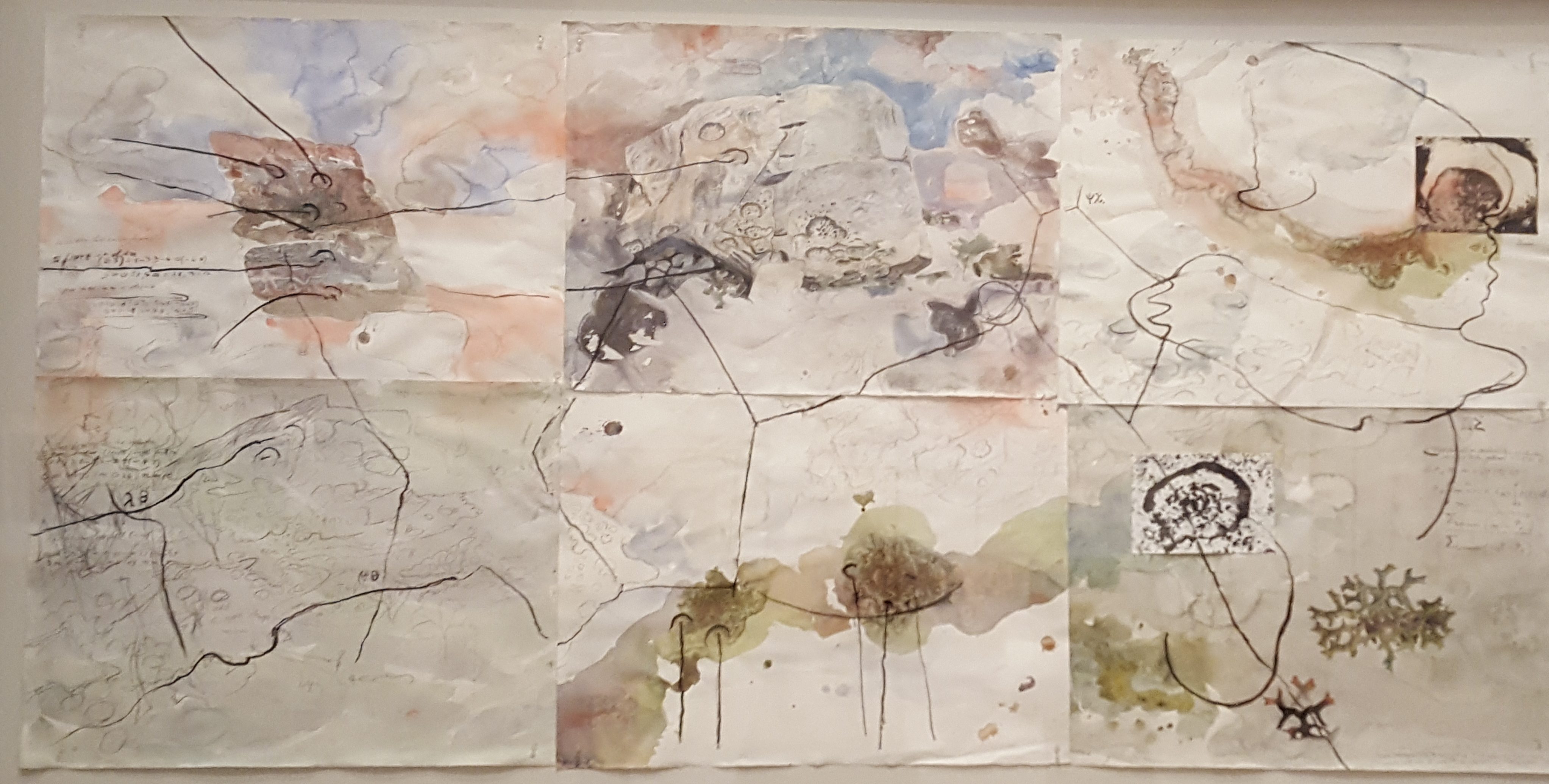
Watercolour on paint lid. R Dempsey: circa 1995. Currently not on display anywhere, except, you know, here.
Personally, there is something more familiar with watercolour than over media to me. Wandering around I didn’t think, when seeing some works, I could have don’t that. No.
This would’ve been familiar to teen me.
I just thought about what I’d managed years ago as a kid and a teen with nothing better to do when staying with my Nan over the summer holidays. Most of it was terrible. Some of it was ok but maybe the less muddy efforts had a something.

Watercolours ghosting the paper even when they’re not deliberately other worldly.
Yet, my works had not much of a something compared to the colours that trembled on the paper like heat haze. Away from the soft yellow winter light outside, it was a kind of magic. That’s something I never mastered.

Deep blue & beautiful and as serious as oil paintings of cities. Photo does no justice.
Maybe one day I will.
There is still time too, for me to gather up the old brushes and for everyone else to see Luminous. It runs for a while yet and is free.
